Aeyesafe-AI senior safety monitoring system

About

Aeyesafe is an AI-powered monitoring system meticulously designed to enhance the safety and well-being of seniors. This project primarily aims to develop a clear and intuitive “Location”data visualization feature, enabling caregivers to effortlessly monitor and comprehend the health status of seniors. This initiative not only facilitates the prevention of accidents but also allows for the swift identification and addressal of potential health concerns.

Team

1 Designer,
1 Product Manager
3+ Engineers

Duration

1 Month
Jul-Aug 2023

Scope

Data Analysis, User Research, UI/UX, Wireframing, Rapid Prototyping, User Testing

Context

Tired caregivers and inadequately attended elderly

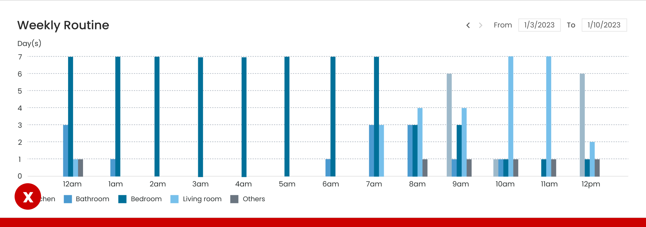
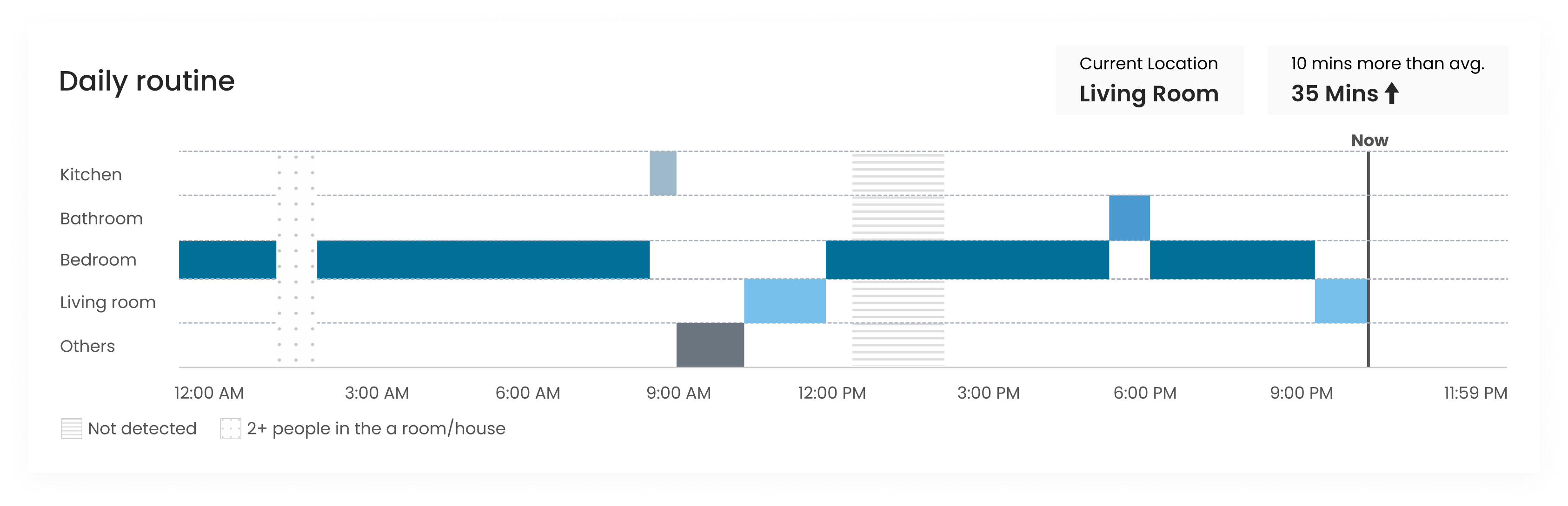
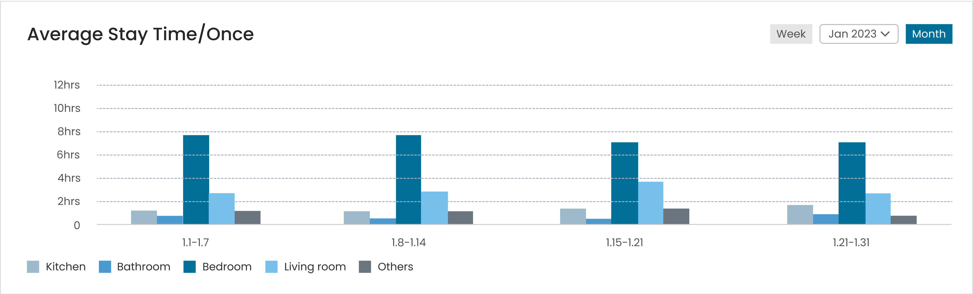
There is a shortage of personnel in the elderly care industry, with each caregiver often having to handle 20-30 elderly individuals simultaneously. Additionally, the nature of the caregiver's job itself is exhausting and requires dealing with unexpected situations. This results in caregivers being overworked and may not promptly identify emergencies or notice long-term changes in the elderly's habits, which could indicate potential risks such as decreased mobility and willingness to engage in activities..

Problem Statement

Caregivers fail to effectively utilize the "Report" Feature

Our data indicates that the "Report" feature is significantly underutilized by users, signaling a potential area of friction. Numerous caregivers have expressed their dissatisfaction, stating their inability to effectively leverage data reports in assessing the health statuses of the elderly individuals they look after.

Solution

I revamped the Location Report to feature intuitive tables and functionalities, transforming raw data into actionable insights regarding seniors' routine fluctuations. The redesigned visualization now facilitates a seamless comparison of real-time location changes against hourly, daily, and weekly activity trends.

Research

Overview

1. Do caregivers need data reports on seniors?

2.What are the current barriers preventing caregivers from utilizing data reports?

3. What information in the data reports is important for caregivers?

I conducted 30-minute interviews with 10 caregivers to understand their needs, challenges, and expectations regarding the data report feature, focusing on the questions listed above.

Interview Insights

90% of caregivers recognize the critical importance of the data report

“Reviewing the location data allows me to grasp residents' recent conditions and habits, aiding me in making informed decisions.”

-Senior care expert 2

Caregivers are not data experts, struggling to extract meaningful insights from the existing data representation.

"I'm not a data guru. Sometimes, it feels overwhelming to sift through all this information to find what's really important."

-Senior care expert 8

Breakdown the Needs

Based on the feedback from user interviews, I distilled the key information that users want to see in the charts. They regard live data as primary and view historical data as a secondary yet vital tool to assist in evaluating the health status of seniors.

Live Information (primary):

History Information (secondary):

Our Focus

How might we create an intuitive, direct, and easily comprehensible data report that empowers caregivers to monitor and evaluate seniors' health, aiding in early prevention of potential incidents?

Ideate

Live location Chart

Exploring the layout 🔍

The Winner 👍

1. Quickly check the current location
2. Display the duration of time spent in the current location, along with alerts for deviations from historical average data.
3. Use varied colors and patterns to represent location changes over the past 12 hours.

Additional Charts

Average Stay Time

Weekly Routine

Bring 3 Charts Together

Design & Iteration

Iteration A
Expanded space to view and analyze chart details more thoroughly.

Before

"The small and dense text made it quite strenuous for me to extract the information I needed, leaving me feeling anxious and fatigued.“

After

“Now, accessing the vital information feels much smoother, even if I occasionally have to scroll down to view the charts.”

Iteration B
Enhanced color coding and spatial contrasts facilitate intuitive understanding of seniors' Routines.

Before

❌:The similar colors make it challenging to distinguish between different rooms.

❌:Unable to discern the seniors' daily routines.

After

✅:Utilizing distinct colors to indicate different times.

✅:Space contrasts provide a clearer visual of the user's daily and weekly movement patterns and preferences.

Final Design

Chart 01

Daily Routine

Rapid Access to Live Location and Key Data Insights

Chart 02

Average Stay Time

Assess seniors' room-stay habits by analyzing the average stay time in different rooms over a period of time.

Chart 03

Weekly Routine

Facilitate a deeper understanding for caregivers of seniors' room stay preferences at various times of the day through detailed room stay data analysis.

Usability Test

"Are you able to understand the chart?”

✅20 Yes

❌0 No

"Can you find the information you need in the chart?”

✅15 Agree

🟰4 Neutral

❌1 Disagree

We engaged 20 users to test our product and followed up with a survey to determine if our design enhancements made chart interactions more intuitive for them.

More Projects📩

< Baidu AI Simultaneous Interpretation-PrimeVocal Space>

For more work inquiries, or to grab a coffee do email me at

wanqiu0930@gmail.com ☕️✨

2023 Wanqiu Wang. All rights reserved.